OK, the truth is I’m not an actual wizard. But I can still show you things you may have never thought possible. From functions of disguise and invisibility to complicated manipulations of time, space, and mathematics, I’m going to lead you through a world of new possibilities within the New Relic Query Language (NRQL).
One of our major innovations at New Relic, NRQL (pronounced “nerkel”) is a query language you can use to query the New Relic Database (NRDB) about the data you use New Relic to collect from your applications. You can then transform those query results into New Relic Insights charts so you can quickly and easily interpret what your data says, and take action.
As a Principal Software Engineer on the NRDB team, I have learned how powerful NRQL can be. These seven tips and tricks of advanced wizardry for querying your data will help you level up your NRQL queries. But beware! While this information is useful for any New Relic customer, the post assumes a general understanding of NRQL syntax, components, and functions.
#1: Disguise data
When I say “disguise data,” I really mean simplify it.
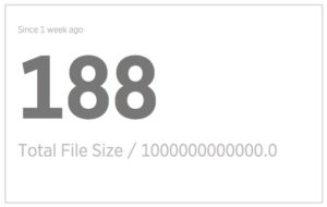
Let’s say you wanted to see the total size of a large set of files, in terabytes. You’d write the following query:
SELECT sum(fileSize) / 1e12
If the files are, for example, 188 TBs, the Insights chart will display the total file size as:
Not very useful. How many zeroes is that, anyway?
If you add an AS statement, however, you can give the measurement a name, which always helps people understand what they’re looking at. So, for the same files, if you query:
SELECT sum(fileSize) / 1e12 AS 'TB'
The Insights chart will display:
188
TB
You can also use the rate() function to scale the result to a particular time period. So if you query the size of files being added to a storage system in TBs per day:
SELECT rate(sum(fileSize), 1 day)
Insights will display:
27.02
TB/day
#2: Ignore data
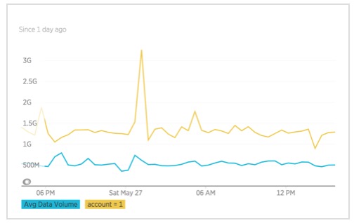
In some cases, you might want to run a query but use different subsets of the data in different parts of the SELECT clause. The following query uses the filter function to compare the data volume queried by account 1 users, versus the average data volume queried by the full population of users:
SELECT average(dataVolume), filter(average(dataVolume), WHERE account = 1)
As you can see in the resulting chart, those account 1 users really like their data, and they tend to query two to three times as much data than the average user.
The percentage function also takes a WHERE clause as one of the arguments. In fact, it’s really just the ratio of two results like the ones in the filter example:
SELECT percentage(sum(fileSize), WHERE account = 1)
The query result shows that almost 2% of collected data comes from account 1.
#3: Transform data
NRDB is an immutable database—there’s no UPDATE statements—but NRQL power users can transform data that wasn’t initially shaped right.
For example, here’s a fine, if slightly pointless, query:
SELECT average(wallClockTime) FROM Query WHERE account < 1000
It just happens to return 0, but why? Well, account IDs are strings, not numbers. You can, however, convert those strings to numbers with the numeric function and Insights will deliver the expected results:
SELECT average(wallClockTime) FROM Query WHERE numeric(account) < 1000
Another bit of pro-level advice: You can send boolean values to Insights. All too often, New Relic customers write a true/false string instead:
SELECT count(*) FROM Transaction WHERE chunked = 'true'
With the boolean function, though, you can turn those into true or false values and match with IS TRUE:
SELECT count(*) FROM Transaction WHERE boolean(chunked) IS TRUE
#4: Facet data
When you facet data, you sort events into groups that each produce a result. Faceting is one of the most popular features of NRQL, but few customers know all the things you can do with it. In fact, fewer than 1% of facet queries use the features I’m about to reveal to you.
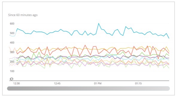
When you facet on an attribute, the facets are usually selected for you, based on the values with the largest results for the query. So the following query will facet on all accounts:
SELECT count(*) FROM FileCreated FACET account
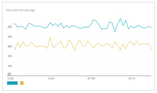
But if you want to look at only a couple of accounts, you can specify the facets that you're interested in by providing an explicit IN clause for the facet. Customers often do this with a WHERE clause, but it’s actually faster to it this way:
SELECT count(*) FROM FileCreated FACET account IN (1, 313870)
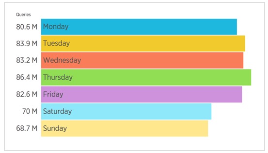
NRQL also has a number of functions for faceting based on time. For example, this query breaks out the results by the day of the week:
SELECT count(*) FROM Query SINCE 1 month ago FACET weekdayOf(timestamp)
Interesting sidenote: New Relic is smart enough to realize that you probably want the results sorted according to the order of days of the week, not by which day had the largest result.
There’s a whole collection of these types of functions you can facet on to understand the periodicity of your data:
hourOfdateOfweekdayOfdayOfMonthOfweekOfmonthOfquarterOfyearOf
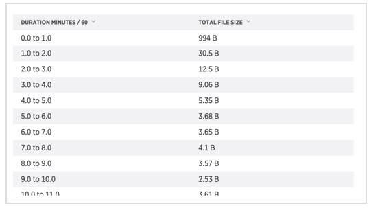
Faceting doesn’t have to be done on individual values of an attribute. You can also facet the values in BUCKETS and get something like a more powerful histogram, because New Relic can compute any value you want, not just counts. For example:
SELECT sum(fileSize) FROM FileCreated FACET BUCKETS(durationMinutes/60)
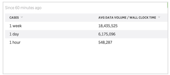
And, for the ultimate in flexibility, there’s FACET CASES. Here you can precisely specify the conditions for each facet, using a NRQL WHERE clause. Note that the order matters: An event will be faceted based on the first condition that matches.
For example, the query below looks at processing rate versus query duration:
SELECT average(dataVolume/wallClockTime)
FROM Query
FACET CASES(
  WHERE durationHours <= 1 AS '1 hour',
  WHERE durationHours <= 24 AS '1 day',
  WHERE durationHours <= 168 AS '1 week'
)
#5: Use unexpected (and unnatural) combinations in NRQL
In these next examples, I’ll show how you can combine NRQL features in unexpected (and maybe even unnatural) ways.
Filter and event type
Here’s a common situation: You build a dashboard in which each widget queries a different type of event, and then when something happens you squint and try to decide if a change in one matches a change in another. What if you could combine them all into one chart? Well, through a clever combination of the filter and eventType functions, you can do exactly that.
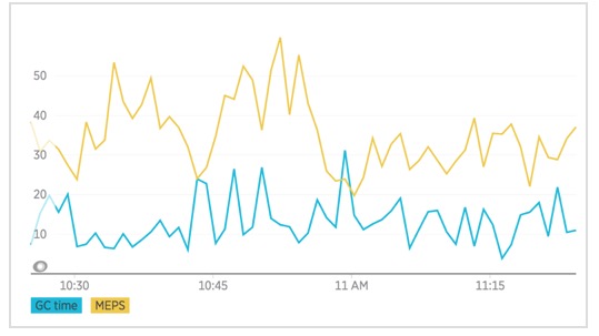
The following query could help you explore a hypothesis that garbage collection time is affecting overall performance of an app.
SELECT FILTER(sum(gcTime), where eventType() = 'NodeStatus'), FILTER(average(meps), where eventType() = 'Query') FROM Query, NodeStatus
The eventType() function lets you limit each data series to one of the two types you’re querying for. This lets you plot them both on the same chart and determine that the hypothesis seems to be false. They aren’t strongly correlated.
This works even if the attribute name is the same in both events. The eventType() function lets you match only on events of a single type:
SELECT filter(sum(fileSize),
WHERE eventType() ='FileCreated')
- filter(sum(fileSize),
WHERE eventType() ='FileDeleted')

FROM FileCreated, FileDeleted
This query tells you that we’re adding 2.7 TB of data to the system per day, even though new data and deleted data are recorded in different events.
Time series histograms
Histograms are also quite popular because they let you see the shape of an entire data set at once. But what if that shape changes over time? Is there a way to visualize that? Well, with a clever combination of NRQL functions there is:
SELECT histogram(duration)
FACET hourOf(timestamp)
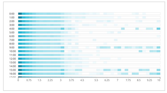
By applying the heat map visualization of faceted histograms with a time-based faceting function, you can see how a histogram changes over time. In the 9:00 hour, and again in late afternoon, this application gets slower.
#6: Put barriers around your data
Sometimes you need to put a “fence” around your data. Let’s look at a few ways to do that.
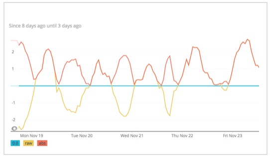
Let’s say you care only how large a value is, not whether it’s positive or negative. With the absolute value function, you can mirror values along the 0 line so that you get only positive results:
SELECT abs(average(…))
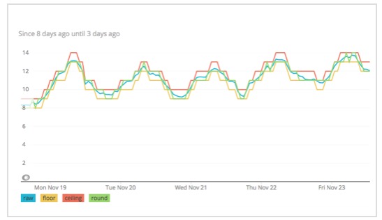
Now, let’s say you want to force a decimal number to an integer; there are three ways to do this:.
- You can hop down with
floor, shown in yellow. - You can jump up with
ceiling, shown in red. - You can go to the closest integer with
round, which is the green line that dances around the original raw values in blue.
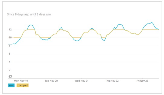
What if you wanted to restrict a curve within some maximum or minimum value. The clamping functions, clamp_min and clamp_max, provide that ability. In this example, I’ve clamped to a minimum of 10 and a maximum of 12:
# 7: Apply advanced mathematics in NRQL
Finally, let’s look at a few techniques using advanced mathematics and statistics in NRQL queries. Let’s start with percentiles. Everyone loves percentiles. But maybe, in this age of modern software, the 99th percentile isn’t good enough.
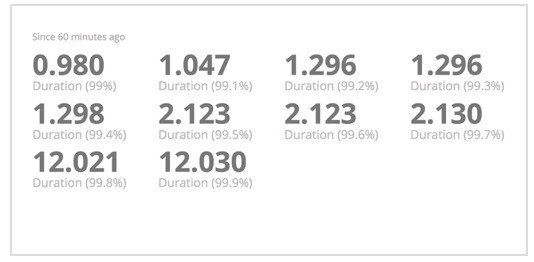
If that’s the case, you’ll be happy to know you can now compute percentiles at any decimal threshold. Here I’ve run the percentile at steps from 99 to 99.9:
SELECT percentile(duration, 99, 99.1, 99.2, …, 99.9)
As you can see, there’s a big difference between the performance at 2 nines and at 3 nines.
NRQL also provides mathematical functions to use in your computations. For example, you now have at your disposal square roots sqrt(n), remainders using mod, two types of exponentiation pow(n,2) and exp(n), and logarithms like log2(n) as well as other bases.
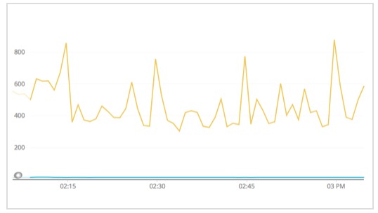
The logarithm functions are particularly interesting. For example, a query of SELECT percentile(duration, 5, 95)leads to two measurements that are so different you really can’t tell what’s going on with the lower line:
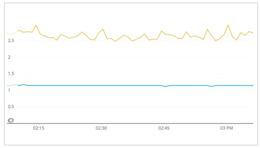
Is it really flat, or is that just a consequence of being blown out by the upper line? By log-scaling them, you can see that the 5th percentile really is flat:
SELECT percentile(log10(duration), 5, 95)
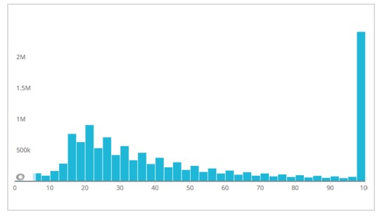
Or, if you’ve ever tried to look at a histogram for a long tailed distribution, you may have run into a chart like this:
That tail has a lot of events in it, but how far does it actually go? Again, log-scaling lets you see everything at once:
SELECT histogram(log10(duration))
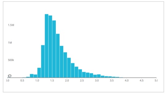
Now you can see that the tail peters out around 10^4th, or 10,000.
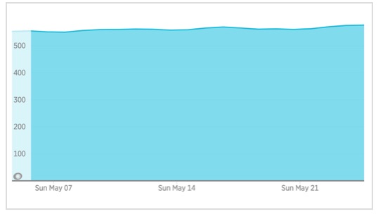
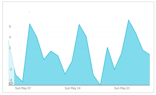
Here’s another use case: If you’ve ever looked at a query and chart like the one shown below, you’ve probably asked, “How fast is that growing?”:
SELECT average(diskUsed)
Calculus fans will recognize this formula for the derivative of a function—or its rate of growth:
You can do that same calculation in NQRL using the latest and earliest functions. These return the first or the last value of an attribute for that time window:
SELECT latest(diskUsed) -
earliest(diskUsed)
So now you can see how fast disk usage is increasing and how it varies from day to day:
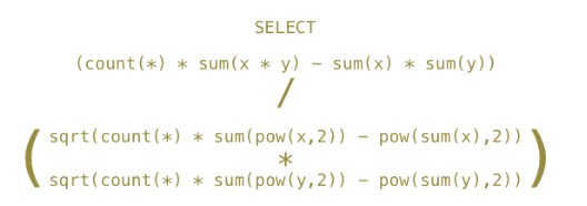
Speaking of calculus, here’s something you might encounter in a statistics textbook—the Pearson correlation coefficient:
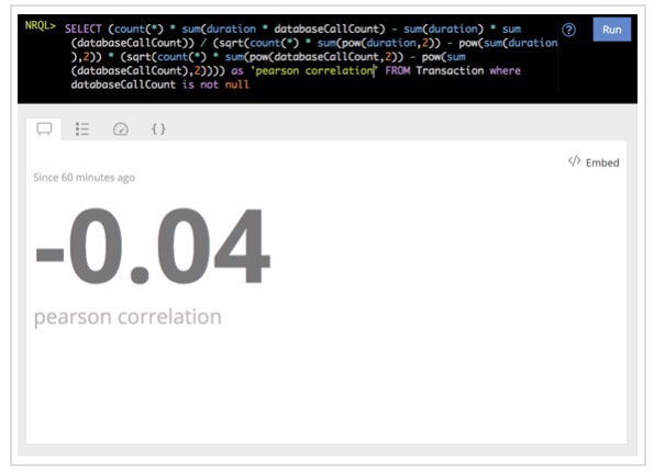
The coefficient is a measure of the correlation between two time series. Do X and Y tend to go up and down together, or are they totally unrelated? All the pieces here are available in NRQL, and you can put them all together like this:
I stylized the above slightly for readability, but it is a valid NRQL query. Just in case you don’t believe me:
Embrace the wizardry
This post covers quite a bit about querying your data in NRQL—from how to reshape the way it’s displayed, to how to group it along various axes, to how to apply advanced statistical functions to it. And this isn’t anywhere close to a definitive list of all the novel combinations you could possible apply.
To learn more, give these tricks a try yourself, and see what else you learn about your data. Then be sure to share your own wizardry in the New Relic Explorers Hub.
The views expressed on this blog are those of the author and do not necessarily reflect the views of New Relic. Any solutions offered by the author are environment-specific and not part of the commercial solutions or support offered by New Relic. Please join us exclusively at the Explorers Hub (discuss.newrelic.com) for questions and support related to this blog post. This blog may contain links to content on third-party sites. By providing such links, New Relic does not adopt, guarantee, approve or endorse the information, views or products available on such sites.

