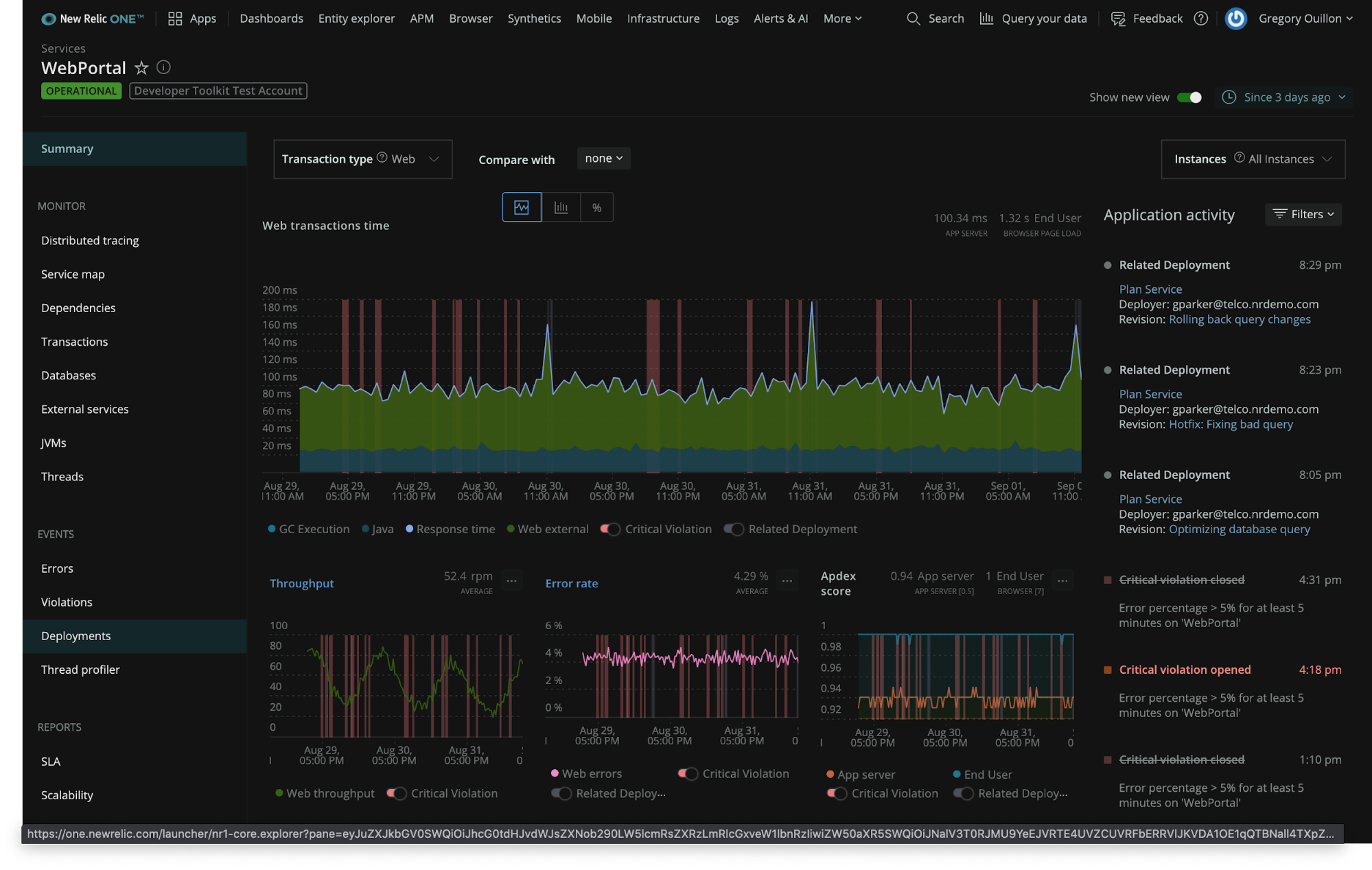
We recently introduced a reimagined New Relic One, with powerful new capabilities, simplified pricing and packaging (including a perpetual free tier), and an intuitive user experience. Within the new New Relic One, we also introduced a comment icon at the top, right hand side of the UI that lets you provide immediate product feedback.
Since our July 30 launch, one topic that has come up quite a bit in this New Relic One feedback channel is dark mode. "New Relic One is too bright for my liking,” said one customer. “An optional dark mode would help with eye strain."
Well, we heard you loud and clear—dark mode is now available.

Essential for many industries
As it turns out, dark mode is way more than just a cool visual option (though it still is that). For many industries, dark mode is essential. Based on my experience, I can tell you about the requirements for aviation and many other industries, such as travel and transportation, logistics, energy, finance, or emergency services.
These industries run Operations Control Centers (OCCs), where teams work 24x7 shifts, in a single or multiple “Follow the Sun” centers to ensure the real-time execution of business operations and even their software development.
Millions of workers spend 10s of hours daily in front of screens to ensure safety-critical or mission-critical operations. For example, in the aviation industry, think of air traffic control towers, airline ground operations, flight operations and dispatch, and flight deck operations.
At my previous company, the SITA group—which managed safety-critical and mission-critical applications, networks, and airport infrastructure—there were two global SITA Command Centers (SCCs) in Singapore and Montreal, where folks worked 13-hour Follow the Sun shifts.
These control rooms are normally restricted access areas, often do not have windows, and are usually low-light environments. Often, OCC employees look at three-to-four different screens at their work position, along with many large, shared screens.
Dark mode benefits
Over the last decade, driven by demand from pilots, air traffic controllers, and flight dispatchers, night mode and dark mode UIs have become hugely popular for good reasons:
- Readability and contrast at low emittance and blue light levels, which reduces eye strain
- Better highlighting of critical information as highlight signals
- Improved readability of multi-layer data, e.g., on geolocated maps
- Better fit with low-light room conditions and a relaxing effect for high-stress roles
Night mode and dark mode are now mainstream in mission-critical and safety-critical applications and have spread across many professional apps. As a photographer, I could not imagine developing my photos in Adobe Lightroom or Adobe Photoshop in a light mode. It is also logical that so many developers use IDEs in dark mode as they code.
So, getting many requests for a dark mode UI was only a logical consequence given so many developers, SREs, and IT ops practitioners spend long hours—sometimes 10 or more hours per day—looking at our UI to deliver more perfect software. Therefore our UX and Development teams have worked hard around the clock to deliver it as quickly as possible.
The dark mode request is also a sign of how mission-critical New Relic has become for thousands of customers.
We welcome your in-product feedback, so keep the comments coming and make sure to connect with our community.

The views expressed on this blog are those of the author and do not necessarily reflect the views of New Relic. Any solutions offered by the author are environment-specific and not part of the commercial solutions or support offered by New Relic. Please join us exclusively at the Explorers Hub (discuss.newrelic.com) for questions and support related to this blog post. This blog may contain links to content on third-party sites. By providing such links, New Relic does not adopt, guarantee, approve or endorse the information, views or products available on such sites.


