Dashboards are important tools that help you visualize your entire stack's performance to understand context and resolve issues quickly. They also help you answer questions such as, "When did the problem start?" and "What's the impact of this issue?"
However, manually maintaining dashboards can be error prone and is sub-optimal in terms of efficiency and security. Manual updates to dashboards also do not provide any modification history, rollback mechanisms, peer reviews, or any of the benefits we normally expect in CI/CD pipelines. That’s why engineers are beginning to treat them like any other important resource: by creating dashboards as code.
For example, using Terraform and the new, built-in log parser rule for Syslog RFC-5424 within New Relic One, you can implement observability as code with a dashboard that organizes Syslog RFC-5424 unstructured messages into attribute/value pairs and lets you drive alerts based on subsets of log data. With the new agentless option for onboarding syslog data, you have a variety of options for data ingest, so long as you properly parse the data when ingesting or directly from the New Relic UI. This blog post guides you through how to create a Syslog RFC-5424 dashboard as code.
Understanding the Syslog format
To build the dashboard, you first need to understand how log severities are defined in the Syslog RFC-5424 format. The PRI part of a syslog, which is a calculated priority value, is used to represent both the facility and severity of the log or event message. PRI calculates the value by first multiplying the facility number by 8 and then adding the numerical value of the severity. For example, a security/authorization (facility = 4) with a critical severity (severity = 2) would have a PRI value of 34 ((4 * 8) + 2). Based on this understanding, you can extract the log severity from the PRI log attribute using the following formula: (pri - ((floor(pri)/8) * 8)).
Step 1: Create your Terraform project
As an infrastructure-as-code tool that you can use to provision all kinds of infrastructure and services, Terraform uses a configuration language known as HCL. Its main purpose is to describe resources that are used to represent infrastructure objects. The resources are processed by specific plugins called providers.
New Relic has an official Terraform provider. It allows you to manage different types of resources such as dashboards, alert channels, and alert policies. For more information about the Terraform provider, see the provider documentation and the quick-tip video shown here.
Start by creating your project folder. Because Terraform is quite flexible and can be adapted depending on the requirements of your project (including multiple environments, multiple accounts, and so on), there are different ways of organizing a Terraform workspace. For simplicity’s sake, we’ll adopt a flat structure for this example.
1. Create a directory for your project.
mkdir newrelic-syslog-monitoring
2. Create a file named versions.tf in your working directory. Terraform uses this file to configure the Terraform client and specify all required providers for the current module, in this case, the newrelic provider.
terraform {

  required_version = ">= 0.13"

   required_providers {

      newrelic = {

         source  = "newrelic/newrelic"

         version = ">= 2.12.0"

      }

   }

}
3. Provide input variables. The New Relic Terraform provider requires an Account ID, Personal Key, and Region (US or EU) to integrate with your account and manage resources. It supports two methods of configuration: using environment variables or a provider block. This simple example uses the provider block, and all required information is received through input variables. Create a file named variables.tf:
variable "NEWRELIC_ACCOUNT_ID" {

  type    = number

}


variable "NEWRELIC_API_KEY" {

  type    = string

}


variable "NEWRELIC_REGION" {

  type    = string

}
4. Create a file named main.tf to be the primary entry point for Terraform. The New Relic Terraform provider is also configured in this file using the input variables previously declared in the variables.tf file:
provider "newrelic" {

  account_id = var.NEWRELIC_ACCOUNT_ID

  api_key    = var.NEWRELIC_API_KEY

  region     = var.NEWRELIC_REGION

}
Step 2: Create the Syslog dashboard
All the dashboard data is retrieved from the Log data type using the NRQL query language. To simplify the queries and avoid repetition, use Terraform locals to represent the Syslog severity formula and the logType filter value.
1. Create a file named dashboards.tf. This file is used to describe the dashboard resource and its widgets/visualizations:
locals {

  syslog   = "syslog-rfc5424"

  severity = "(numeric(pri) - (floor(numeric(pri)/8) * 8))"

}


resource "newrelic_dashboard" "syslog_dashboard" {

  title             = "Syslog Dashboard"

  grid_column_count = 12

}
2. Add widgets and visualizations.
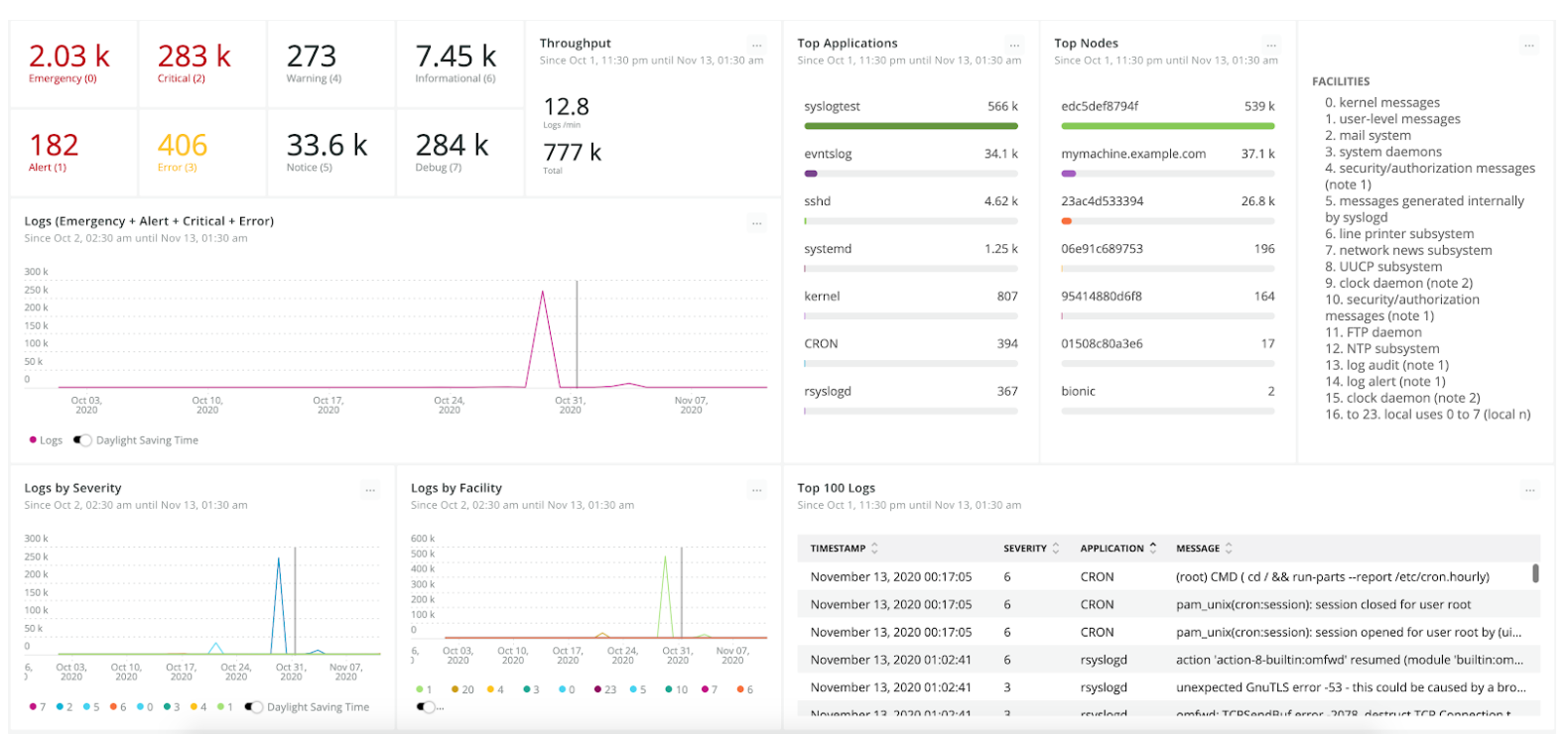
The first step in designing your dashboard is to define what you want to achieve and which visualizations will be most important to enable that. For this example, the dashboard gives an overview of application health.
Note: All widget code goes inside the "syslog_dashboard" {...} block.
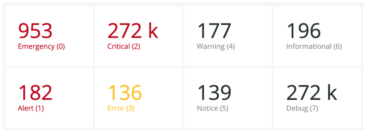
Widget 1: Billboard counters by severity
The log's severity is one of the most important fields available in the Syslog format and is widely used on this dashboard's visualizations. Billboard charts show the log counters by severity, coloring them yellow or red depending on the threshold_yellow and threshold_red values. The charts make it easy to see what's happening with your applications and catch your attention if any problematic log arrives.
Because these billboard charts share nearly identical code, you can take advantage of Terrafrom's dynamic blocks and reuse the code to iterate through a severity_billboards map to configure every widget. To accomplish this, add a severity_billboards map inside the locals{...} block with the following content:
locals {

  syslog   = "syslog-rfc5424"

  severity = "(numeric(pri) - (floor(numeric(pri)/8) * 8))"


  severity_billboards = tomap({

    "emergency"     = { severity =  0, row = 1, column = 1, threshold_red = 1 },

    "alert"         = { severity =  1, row = 2, column = 1, threshold_red = 1 },

    "critical"      = { severity =  2, row = 1, column = 2, threshold_red = 1 },

    "error"         = { severity =  3, row = 2, column = 2, threshold_yellow = 1 },

    "warning"       = { severity =  4, row = 1, column = 3 },

    "notice"        = { severity =  5, row = 2, column = 3 },

    "informational" = { severity =  6, row = 1, column = 4 },

    "debug"         = { severity =  7, row = 2, column = 4 }

  })

}
Then add generic code for the widget inside the syslog_dashboard" {...} block:
  dynamic "widget" {

    for_each = local.severity_billboards

    content {

      title            = ""

      nrql             = <<-EOF

        SELECT

          count(*) as '${title(widget.key)} (${widget.value.severity})'

        FROM Log

        WHERE logType = '${local.syslog}' AND ${local.severity} = ${widget.value.severity}

      EOF

      visualization    = "billboard"

      width            = 1

      height           = 1

      row              = widget.value.row

      column           = widget.value.column

      threshold_yellow = try(widget.value.threshold_yellow, null)

      threshold_red    = try(widget.value.threshold_red, null)

    }

  }
Your final result should look similar to this:
Widget 2: Billboard for log throughput
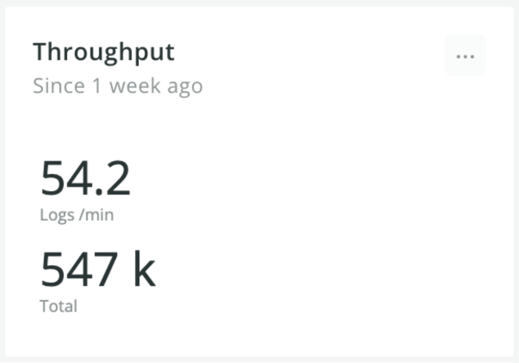
This chart shows the total number of logs and the rate per minute your applications are sending them.
  widget {

    title         = "Throughput"

    nrql          = <<-EOF

      SELECT

        rate(count(*), 1 minute) as 'Logs /min',

        count(*) as 'Total'

      FROM Log

      WHERE logType = '${local.syslog}' SINCE 1 hour ago

    EOF

    visualization = "attribute_sheet"

    width         = 2

    height        = 2

    row           = 1

    column        = 5

  }
Your final result should look like this:
Widget 3: Line chart to view problem-related trends over time
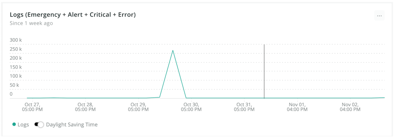
This chart counts all logs with severity equal to Error(3), Critical(2), Alert(1) or Emergency(0) and displays the result over time. Spikes on this graph show that you might have problems with your applications that require actions to be taken to resolve them.
  widget {

    title         = "Logs (Emergency + Alert + Critical + Error)"

    nrql          = <<-EOF

      SELECT

        count(*)

      FROM Log

      WHERE logType = '${local.syslog}' AND ${local.severity} < 4

      TIMESERIES AUTO

    EOF

    visualization = "line_chart"

    width         = 6

    height        = 3

    row           = 3

    column        = 1

  }
Your final result should look something like this:
Widget 4: Bar charts by application and node
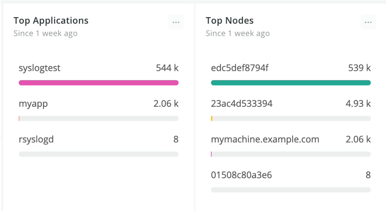
These charts show the number of logs by application and hostname. They can also be configured to filter the current dashboard just by clicking on the application/hostname bars.
  widget {

    title         = "Top Applications"

    nrql          = <<-EOF

      SELECT

        count(*)

      FROM Log

      WHERE logType = '${local.syslog}'

      FACET app.name

    EOF

    visualization = "facet_bar_chart"

    width         = 2

    height        = 5

    row           = 1

    column        = 7

  }


  widget {

    title         = "Top Nodes"

    nrql          = <<-EOF

      SELECT

        count(*) as 'Logs'

      FROM Log

      WHERE logType = '${local.syslog}'

      FACET hostname

    EOF

    visualization = "facet_bar_chart"

    width         = 2

    height        = 5

    row           = 1

    column        = 9

  }
Your final result should look similar to this:
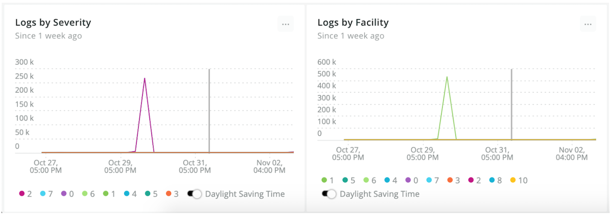
Widget 5: Line charts to view log counters by severity and facility over time
The idea behind these charts is to display the number of logs by severity and facility your applications are sending over time. This way you can easily detect spikes of any severity or facility and identify when they started and stopped.
  widget {

    title         = "Logs by Severity"

    nrql          = <<-EOF

      SELECT

        count(*)

      FROM Log

      WHERE logType = '${local.syslog}'

      FACET string(${local.severity}) as 'Severity'

      TIMESERIES AUTO

    EOF

    visualization = "faceted_line_chart"

    width         = 3

    height        = 3

    row           = 6

    column        = 1

  }


  widget {

    title         = "Logs by Facility"

    nrql          = <<-EOF

      SELECT

        count(*)

      FROM Log

      WHERE logType = '${local.syslog}'

      FACET floor(numeric(pri)/8) as 'Facility'

      TIMESERIES AUTO

    EOF

    visualization = "faceted_line_chart"

    width         = 3

    height        = 3

    row           = 6

    column        = 4

  }
Your final result should look similar to this:
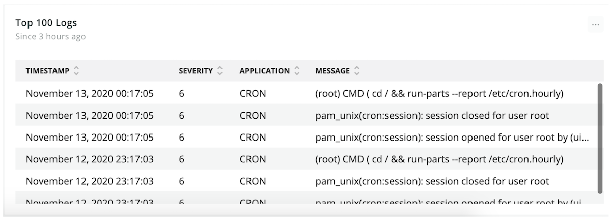
Widget 6: Event table to display the top 100 logs
This chart displays the 100 most important logs prioritized by severity.
  widget {

    title         = "Top 100 Logs"

    nrql          = <<-EOF

      SELECT

        ${local.severity} as 'Severity',

        app.name as 'Application',

        message

      FROM Log

      WHERE logType = '${local.syslog}' LIMIT 100

    EOF

    column        = 7

    row           = 6

    visualization = "event_table"

    width         = 6

    height        = 3

  }
Your final result should look like this:
Widget 7: Markdown summary for Syslog facilities
This chart lists the names of the syslog facilities on your dashboard for easy reference.
widget {

    title         = ""

    width         = 2

    height        = 5

    row           = 1

    column        = 11

    source        = <<-EOF

    ### Facilities

    1. kernel messages

    2. user-level messages

    3. mail system

    4. system daemons

    5. security/authorization messages (note 1)

    6. messages generated internally by syslogd

    7. line printer subsystem

    8. network news subsystem

    9. UUCP subsystem

    10. clock daemon (note 2)

    11. security/authorization messages (note 1)

    12. FTP daemon

    13. NTP subsystem

    14. log audit (note 1)

    15. log alert (note 1)

    16. clock daemon (note 2)

    to 23. local uses 0 to 7 (local n)

    EOF

    visualization = "markdown"

  }
Your final dashboard should look similar to this:
Step 3: Apply your code
You can install the Terraform client either by downloading the binary from www.terraform.io/downloads.html or using your operating system's package manager. More instructions on how to install Terraform in different environments can be found here.
After you install the Terraform client, run the following command in your working directory:
terraform plan -var NEWRELIC_ACCOUNT_ID=<YOUR-ACCOUNT-ID> -var NEWRELIC_API_KEY=<YOUR-API-KEY> \

-var NEWRELIC_REGION=<US or EU>
The terraform plan command creates an execution plan and then determines which actions are necessary to achieve the desired state specified in the configuration files. In this case, your dashboard resource is added.
Finally, run the following command to apply all pending actions and create the resources in the New Relic One platform:
terraform apply -var NEWRELIC_ACCOUNT_ID=<YOUR-ACCOUNT-ID> -var NEWRELIC_API_KEY=<YOUR-API-KEY> \

-var NEWRELIC_REGION=<US or EU>
Terraform uses states to map your local resources to the real world. When you have a declared resource such as resource "newrelic_dashboard" in your files, Terraform uses the map to know that the New Relic Dashboard ID 1234 is represented by that resource. That said, if you apply this project in different machines without sharing the state, Terraform will recreate all resources instead of updating them. Setting up a remote state would prevent this situation.
HashiCorp offers a Terraform Cloud solution that automates Terraform workflow out of the box. It's also possible to use Atlantis, which is a tool that automates Terraform through pull requests, taking your observability as code to the next level.
Step 4: Add alerts for real-time notification
Although dashboards are essential tools for detecting and troubleshooting problems, unless you’re watching them 24 hours a day, you can miss important logs. Setting up alerts gives you instant notification whenever an important metric hits a threshold.
New Relic alerts help you solve your application issues faster and with less noise before they turn into critical incidents. New Relic’s third-party integrations, such as PagerDuty and Slack, make the notification process very efficient and adaptable to your team’s needs.
The New Relic Terraform provider supports all required alerting resources to monitor your syslog applications. You can, for example, create different alert channels per team, responsibility, node, or application, notifying different people in various ways when applications are reporting errors.
For the example, you can reuse the dashboard queries and define the following NRQL alert conditions:
- A static threshold alarm for critical severities Error(3), Critical(2), Alert(1) and Emergency(0).
- Baseline alarm in upper direction for log counters with severity < 4 to detect abnormal unhealthy spikes.
- Additional alerts depending on your environment and system characteristics, such as a static alert for logs with severity < 4 and facility equal to security/authorization messages(4), which would appropriately send a notification message to the #security-team Slack channel, for example, and not the whole company.
(For more information about New Relic alerts with Terraform, see this blog post.)
Ready to create a Syslog dashboard?
All the code used in the example can be found in this GitHub repository. If you don't want to use Terraform but would like to try out the dashboard, you can import it by copying this JSON file content, replacing the <YOUR_ACCOUNT_ID> placeholder with your Account ID, and importing it into New Relic using the UI (Dashboard > Import dashboard option). With New Relic, we get help you learn more about custom dashboards and AIOps.
If you’re new to New Relic and want to try out the New Relic Terraform provider, sign up for a new account with 100 GB/month of free ingest.
The views expressed on this blog are those of the author and do not necessarily reflect the views of New Relic. Any solutions offered by the author are environment-specific and not part of the commercial solutions or support offered by New Relic. Please join us exclusively at the Explorers Hub (discuss.newrelic.com) for questions and support related to this blog post. This blog may contain links to content on third-party sites. By providing such links, New Relic does not adopt, guarantee, approve or endorse the information, views or products available on such sites.


